Posted on Leave a comment

Color in Your Store

color palette

Color has a powerful impact on consumers. By understanding how to use color to your advantage, you can create a welcoming and engaging shopping experience for your customers.

Selecting a palette

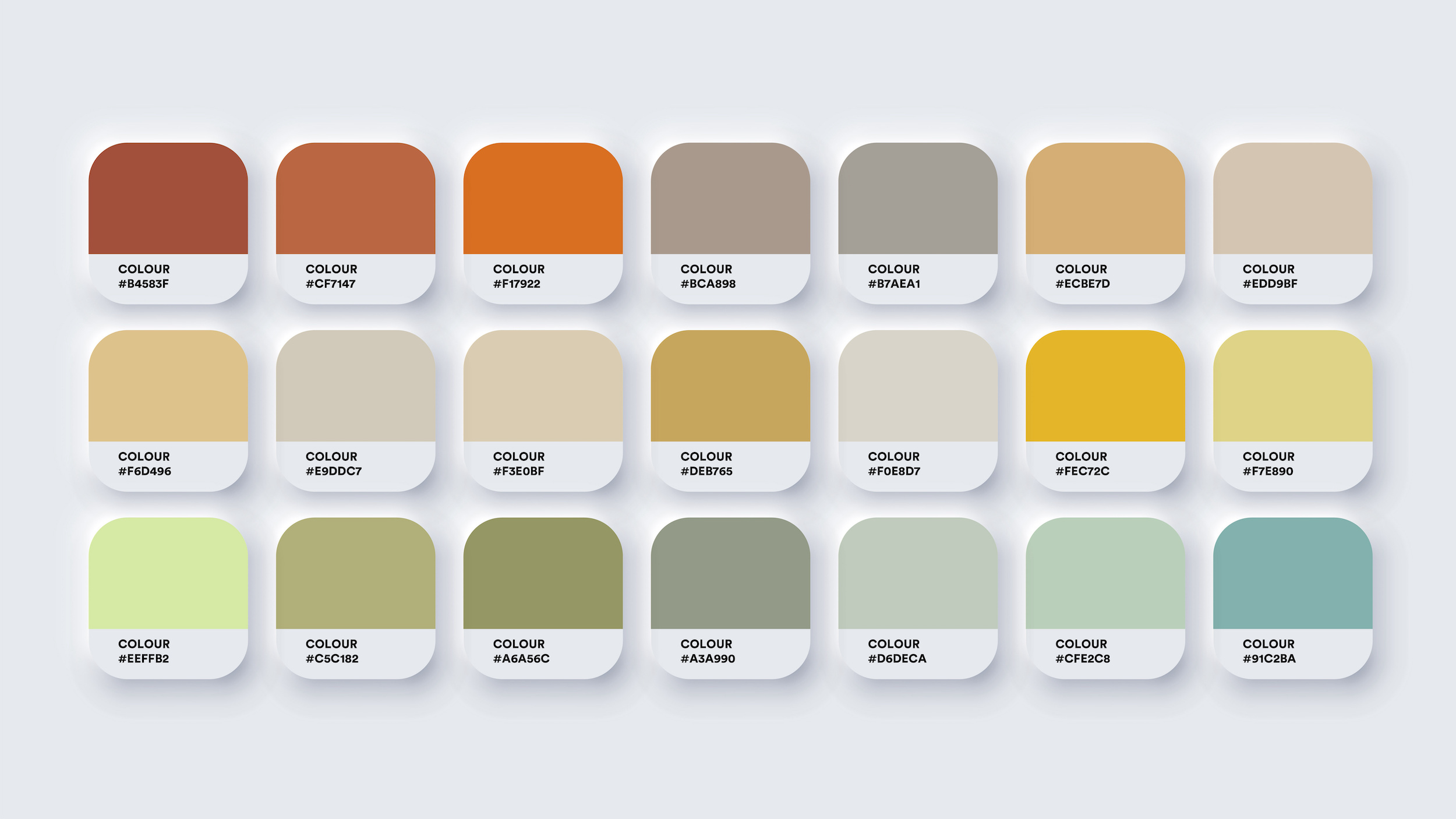
When selecting a palette for your store, start by considering your brand. Your palette should consist of at least three colors:

  • A dominant color (the main color used in your logo)
  • An accent color
  • One or two neutral colors

Using color in your store

To effectively use color in your store, consider the following tips:

  • Use your dominant color on walls and displays that you want to draw attention to, such as the checkout counter or a specific department. This will attract customers’ eyes and encourage them to explore.
  • Use your accent color sparingly, as a way to add visual interest to your displays, shopping bags, or other areas.
  • Choose neutral colors for the rest of your store. Consider options such as cream, beige, tan, or taupe, which can create a calm and welcoming atmosphere.

Warm vs. cool colors

Different colors can evoke different emotions in customers. Consider the following:

  • Warm colors like red, yellow, and orange can create a sense of energy and excitement. However, be cautious about using too much red, as it can also create a sense of urgency or even anxiety.
  • Cool colors like blue and green are generally calming and relaxing, and are often preferred by shoppers.
  • Colors like purple and orange can be more controversial, but if they align with your brand and the overall feel of your store, there’s no reason not to use them.

This post was inspired by “Color on Your Sales Floor” by Lyn M. Falk, published in the April 2023 issue of Creative Retailer. Falk is the owner and president of Retailworks Inc., a registered interior designer and a retail consultant.


If you’re looking for more information to guide you in owning a retail business, subscribe to Creative Retailer today. Already a subscriber? No worries—join our Facebook group for insights and dialogue from industry specialists like you. And don’t forget, you can always purchase single issues if you prefer that instead.

Posted on Leave a comment

Retail Merchandising

merchandising

Psychology plays a huge role in retail merchandising. Read on for ways to display your merchandise to turn inventory faster.

Simple tricks

There are many ways to arrange your merchandise to increase sales, but let’s start with the 2-finger rule. Simply put, there should be a two finger space in between your product and the top of the shelf. This both maximizes your shelf space as well as presents the product logically to customers.

Speaking of shelves, most people scan shelves in a Z when looking. Customers also compare products horizontally.

It goes without saying, but try not to place heavy products on higher shelves. 15% of people didn’t buy an item because it was too heavy when moving it.

Finally, consider rotating products. Moving an item from the bottom shelf to eye-level increased sales by 87 percent.

Color merchandising

Color obviously plays a role too. Check out the list below to encourage different feelings:

  • Blue: Promotes peace and tranquility
  • Green: Encourages freshness and nature
  • Purple: Equates to spirituality
  • Yellow: Spreads energy and happiness
  • Pink: Makes people romantic
  • White: Creates a simple and clean atmosphere

There are hundreds of tips that I’m sure we didn’t cover. What have you learned in your career you can share with the quilt retailer community? Comment on this blog for merchandising tips that have worked for you.


If you’re looking for more information to guide you in owning a retail business, subscribe to American Quilt Retailer today. Already a subscriber? No worries—join our Facebook group for insights and dialogue from industry specialists like you. And don’t forget, you can always purchase single issues if you prefer that instead.

Posted on Leave a comment

Make the Most of Mannequins

mannequins

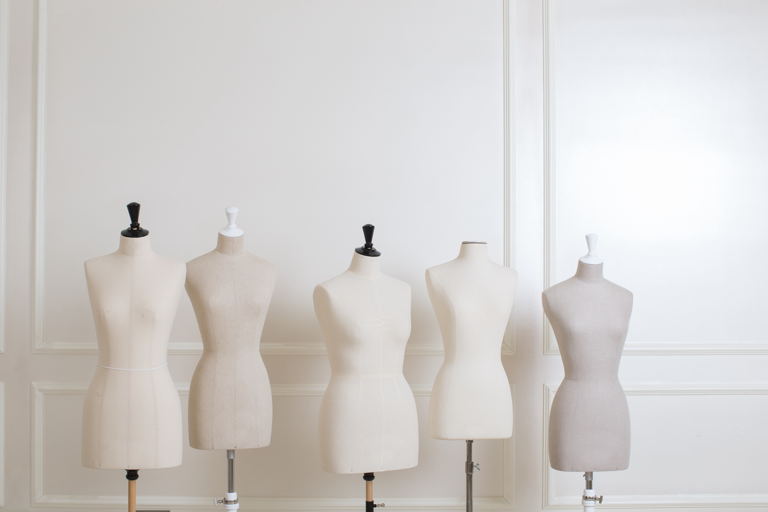
Did you know customers are more likely to notice mannequins than any other fixture in your store or window display? This is simply because mannequins look like them. Read on for six ways to dress a form to add to your store’s environment.

How to Dress Mannequins

  • Be dramatic: Think of items you can style on your form. The goal is to spark interest to products customer wouldn’t have otherwise thought of to increase sales. Pro tip: use items that are experiencing a sales slump!
  • Add-on: Consider adding surprise items, such as a button necklace, to your mannequin. This might entice shoppers to head to your lightly visited button area in the corner of your store.
  • Tell a story: Use your mannequin to tell a story about the product. It’s a much more effective way of connecting with customers compared to showing a slew of choices in a strewn-out manner.
  • Think light: Less is more. Try not to overdue props or supplies as the product should stand for itself.
  • Try marketing: Use your mannequin in social media. Consider adding a competition for followers to name the mannequin (where the winner gets a prize)!
  • Be intentional with color: Colors that highlight current trends (think Pantone’s Color of the Year) are a great way to show your signature style.

Inspiration for this post came from “Dress Them Up” by Anna Woodward published in the August 2022 issue of American Quilt Retailer.


If you’re looking for more information to guide you in owning a retail business, subscribe to American Quilt Retailer today. Already a subscriber? No worries—join our Facebook group for insights and dialogue from industry specialists like you. And don’t forget, you can always purchase single issues if you prefer that instead.