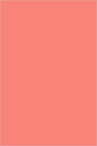
 If you haven’t already heard the news, Pantone’s Color of the Year for 2019 is Living Coral.
Pantone has released the Color of the Year every December for the past 20 years. The color is supposed to reflect both trends in design and in our culture.
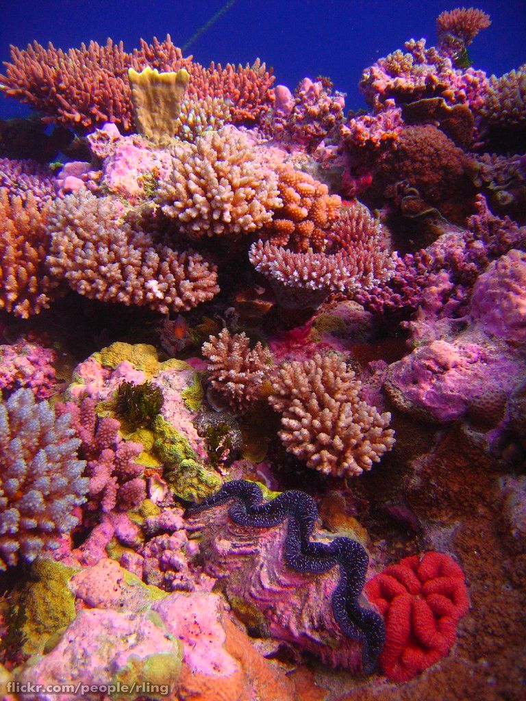
Living Coral is a shade of orange with gold undertones, and is supposed to be reminiscent of the coral reef. The coral reef acts as a water filtration system and gives shelter to a vast range of sea life.
Pantone said paying attention to the environment and our roles in it has become even more prevalent in today’s society. Living Coral evokes energy, something the environment needs as it’s natural resources continue to be depleted.
According to Pantone, Living Coral creates an “innate need for optimism and joyful pursuits” and “authentic and immersive experiences that enable connection and intimacy.”
This is Pantone’s way of saying our culture needs to spend more time unplugged and start living in the moment. Living Coral is supposed to evoke a sense of togetherness that technology lacks and can even take away from our lives.
Living Coral has already made it’s debut on the runway and in make up pallets, and you can expect social media influencers to start using the color more too. Living Coral can already be found on beach themed attire and spring pastels.
The pink-orange hue follows last year’s Color of the Year Ultra Violet, a color that many thought honored the late musician Prince and was a nod to politicians working together.
If you’re looking for more information to guide you in owning a retail business, subscribe to American Quilt Retailer today. Already a subscriber? No worries—join our Facebook group for insights and dialogue from industry specialists like you.

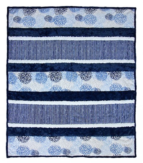 Earlier this year, Shannon Fabrics announced Bluebell as their color of the year. The color of the year is chosen following design trends, and is a time every creative looks forward to.